
How to use visuals to improve your social posts
What makes an engaging post? It’s the combination of good copy and visuals that complement your message.
Katarzyna Kowalewska is a LinkedIn creator and social media expert who certainly knows how to create great visuals to tell a story.
I came across Katarzyna’s work several months ago. After liking a few of her posts, I realised that I enjoy how she uses images to strengthen the post’s message.
I asked her a few questions to find out more about her work and what we could learn from her
How do you decide on the visuals to create (and how they complement a post)?
I started publishing on LinkedIn in May 2022. I experimented with the platform, different content formats, and visuals. There were a lot of trials and many errors in this process. However, it was necessary - to find out what my audience likes and to find my own voice, style and system of working with my content. My unfair advantage is that I am a social media manager, and during my career, I have done literally everything that a social media manager can do - from writing concepts to creating simple visuals to reporting. BUT, back then I must confess that I disliked LinkedIn and found it too complex back then.
I was getting some positive feedback about my posts, but it wasn't enough to attract a broader audience. In the early summer of 2023, I knew I needed a format that would work as a tumb-stopper and make my content stand out on the platform.
In the meantime, I became interested in visual thinking and visual facilitation. So, after brainstorming with myself, I came up with a way of combining those concepts with my social media presence. It's just a start for me, and so far, I use just simple frameworks, but I keep working on my skills and the quality of my work.
Link to the full post (the copy is also important!)
How do you work on content creation? Have you noticed which posts tend to get more engagement?
I get my ideas from everywhere - my experience, reflections, daily work, coffee chats with other "LinkedIners", podcasts, books, articles, industry news... What helps is that I belong to one of my target groups, so I know very well our pain points and struggles. Sometimes, when writing, I think what advice I would give to my younger self :-)
When verifying my ideas, I always ask myself these three questions:
Will it be helpful?
Will it bring value?
Will it be interesting?
Post creation itself goes two folds in my case - sometimes first, I have an idea for a topic, and then I see if and how I can present it visually; sometimes first, I have an idea for a visual metaphor, and then I think about how I could use it to illustrate something I could share. A few times, I came up with a visual for an old post that I reposted with a new asset.
I keep my ideas and notes in Notion and regularly return to them. When I have time to create content (usually on Saturday mornings), I don't need to spend hours on ideation because I am ready to write and/or do visuals.
There are a few conditions that I take into account when deciding on the visual:
- I don't pressure myself to publish a visual with every posting. If I have a good idea, I go for it. If not, or the idea is not good enough, or I don't have enough graphical skills to present it (I am not a graphic designer, in the end!) - I drop it (at least until I figure it out). Quality over quantity.
- A visual is just an extra element. It helps as an eye-catcher, but the most important is the value/insight/unique POV that I provide with my copy. If my insights were boring or low-quality, no visual would help. That's not how you build trust with people on social media, particularly LinkedIn. Again - quality over quantity.
- A visual is, most of the time, a metaphor for what I write about in the copy. It supports the text and helps grasp it easier
- This visual metaphor needs to be easy to understand. If it is too complex or doesn't hit home, I would lose people immediately (yes, competition for attention in the feed is fierce). That's also one of the reasons why I keep it minimalistic (it's about presenting an idea, not doing a fireworks show).
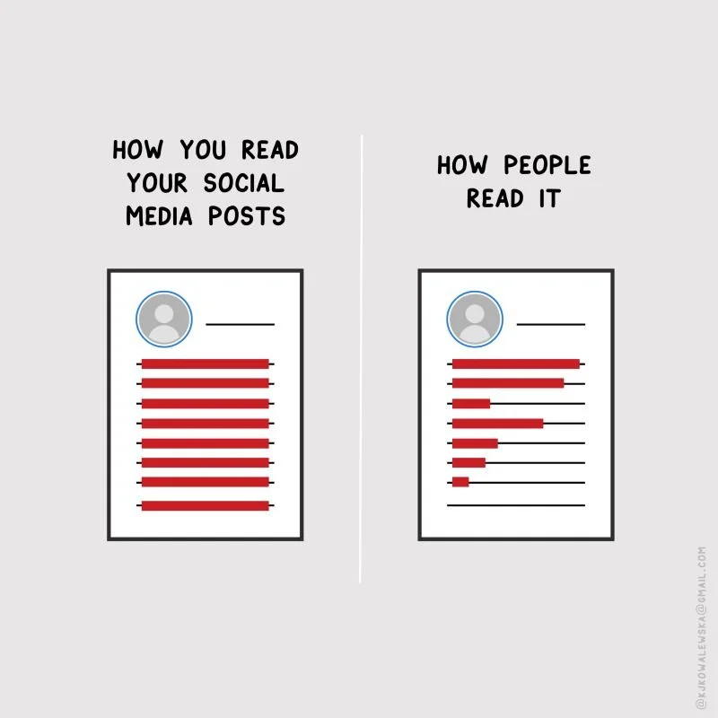
Obviously, as a social media manager (and data geek!) I follow my metrics. So far, I noticed the most engaging posts are those that present a comparison of something.
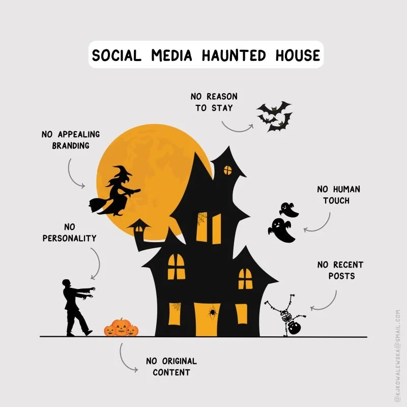
My most popular post so far was the Halloween post:
Link to the full post (the copy is also important!)
This post was a complete experiment, and I was not convinced to post it. I thought people would take it as something silly. But on Halloween morning, I saw my feed was full of posts related to this day, so I asked myself, "Why not?". And it worked - a good lesson that you don't always need to be super serious, and even with lighter content, you can share something that brings value to people on LinkedIn.
There are also visuals that didn't work and posts that underperformed. C'est la vie. Those failures also gave me insights into my audience preferences and directed my further work.
The most important thing is to think in the mid- and long-term and keep your big goal in mind.
What can we learn from Katarzyna?
Don’t be afraid to try out new ideas
Not every post will be a success (and that’s okay!)
Think like your audience
Use visuals to improve your copy
Find inspiration from your life, work, conversations with others